
Sanford Health Plan UX

The Outcome
To reveal the outcomes first, the client’s success after deployment was
a 37% decrease in customer service calls, and a 23% increase in lead generation.
Here are some insights
Road to Improving UX.
1. Understanding the Current State.
The website had two main User Types: Shoppers and Members. Our focus was on improving the experience for shoppers, since members had a clear user path to a login.
To put it in one sentence, the experience for shopers were a Cognitive Overload, too many choices, duplicative and redundant links, and not enough guidance. The website experience was forcing the shoppers to rely on calling customer service for answers.
Old Homepage Example
2. Analyzing Survey Results Provided by Client.
The client had run a survey on the website, collecting feedback from its visitors. The survey provided some interesting qualitative data from its written feedback. The quantitative data was less informative. The majority of the responses were from members, skewing the results. We had to find a different way to understand shoppers’ behavior and their needs, hence the Heatmap in the next section.

Survey Doc
3. Understanding Users’ Behavior Through Heatmap and User Flow.
Excluding the high interaction on a Login CTA. The heat map provided insights into what shoppers are interested in, with some clicking on text that had no interaction.
The findings revealed user aren’t interested in the content the website is displaying, wanting only few actions to get the results they want.
In parallel with Heatmap, we analyzed user flow through Google Analytics. The data revealed that users would explore the website in a loop, from the homepage to an interior page, back to the homepage. Resulting in a dropoff without conversion, again having to rely on calling customer service for the information they need.

Overview of Heatmap
Solutions Implemented
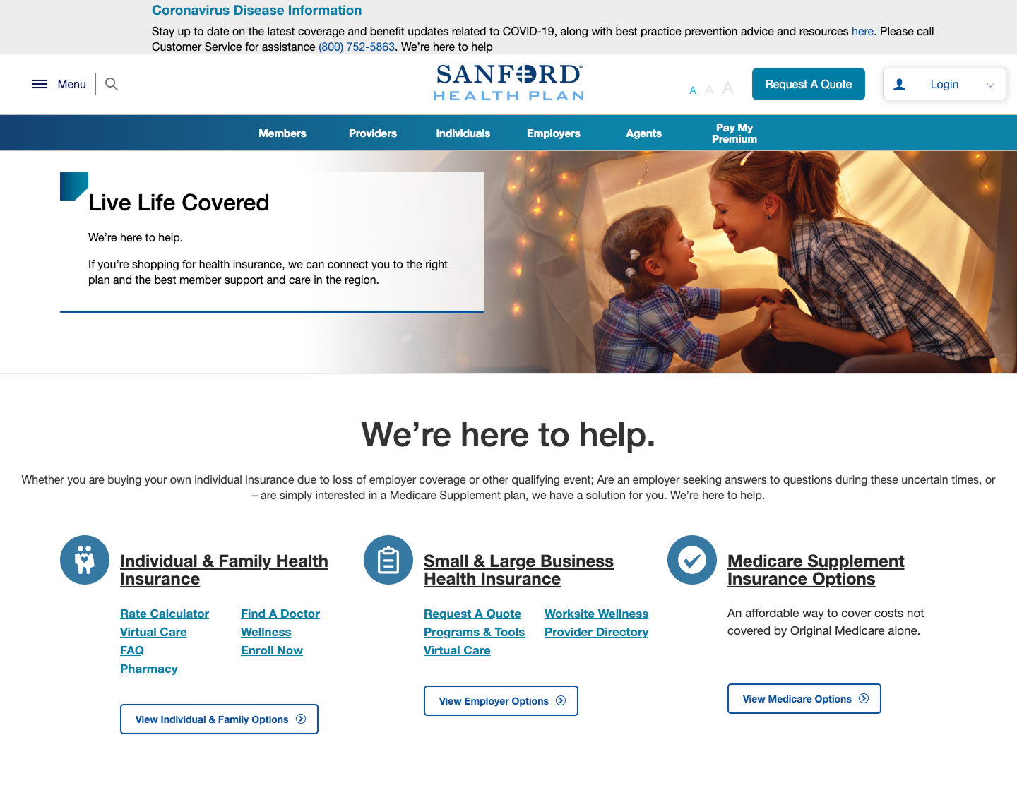
1. Navigation and Homepage Information Architecture Update.
Updated navigation with verbs targeting the main users.
Added high-value call to action on Hero for users to act upon without a second thought.
Removed all unnecessary links and content that would deter users from their desire flow to optimize the experience.

2. Interior Page Update
Placing information that is needed to guide the user to the proper flow.

Final thoughts…
I thoroughly enjoyed this research-intensive project, which serves as yet another compelling example of how a minimalist approach can yield powerful results in the digital space. This experience reinforces the principle that simplicity often leads to greater impact and effectiveness online.