
Dunn-Edwards Website UX

The Outcome
To reveal the outcomes first, the client’s success after deployment was
a 43% increase in conversion rates and a 30% increase in user engagement.
Here are some insights
Road to Improving UX.
1. Understanding the Navigation and Webiste Architecture.
After analyzing website traffic and conducting User Testing for targeted users, such as contractors, architects, designers, property managers, etc.
We identified that the experience was heavily catered toward returning users while making the experience for new users daunting and overwhelming, resulting in a drop-off after viewing 1~2 pages.
Why? When asking users where they would start if they had a paint project, 5 out of 7 navigation items could be the starting point; if the user didn’t find the needed information, they would drop off. The consensus from users was that navigating the website felt like a catalog than a digital product they are accustomed to.
When it comes to digital experience, less is more, and users need clear wording on where to start.
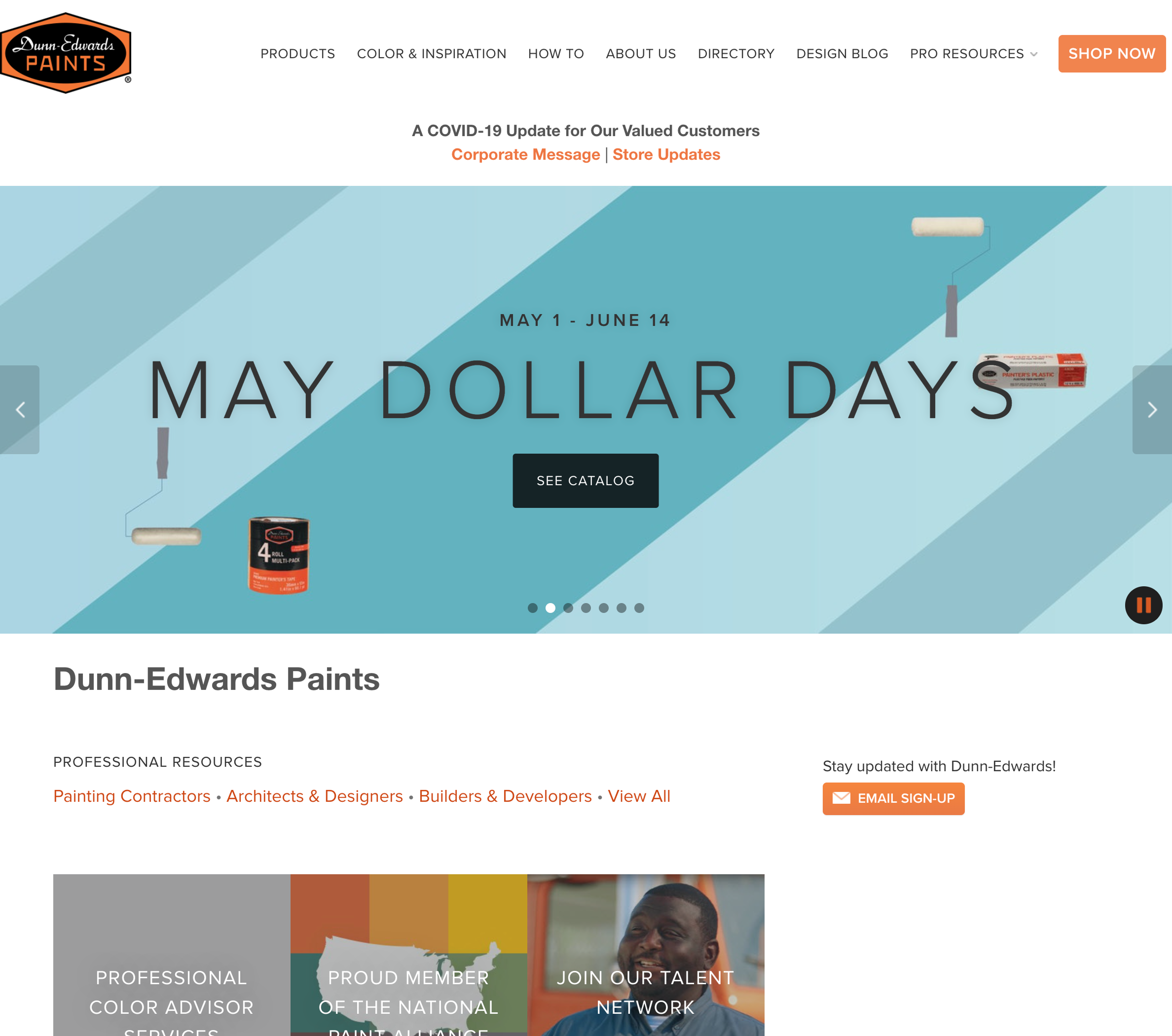
Previous Homepage and Navigation Example
2. The website did not reflect the current business strategy.
While conducting stakeholder interviews and brainstorming sessions. We’ve identified that the website does not reflect the current sales team’s business strategy.
While the website content makes a clear distinction between B2B and B2C customers, the sales team's tactic was to reach out to customers who are new to the industry whom has the potential to be either B2B or B2C, supporting the case found during user testing for new users.
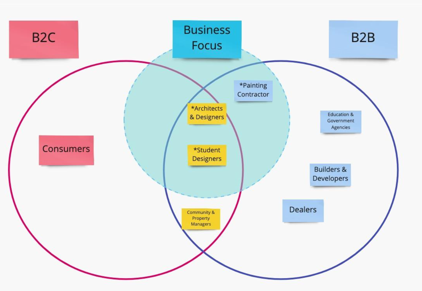
Business Focus
3. User flow Issue.
After landing on the homepage, 50% of new user traffic funnels to the color page. While the color page provided the necessary information, the guidance for the next step wasn’t so clear.
Users were given 5 options, only 2 of which were related to the page they were on; the rest were secondary but were placed in the same visual hierarchy on the page. For users who selected those secondary options, we observed an increase in drop-offs compared to the related CTA, resulting in lost business potential from new users.
The page needed to focus on guiding them to the next desired call to action to start their relationship with the business, reducing traffic to unwanted flows; again, less is more.
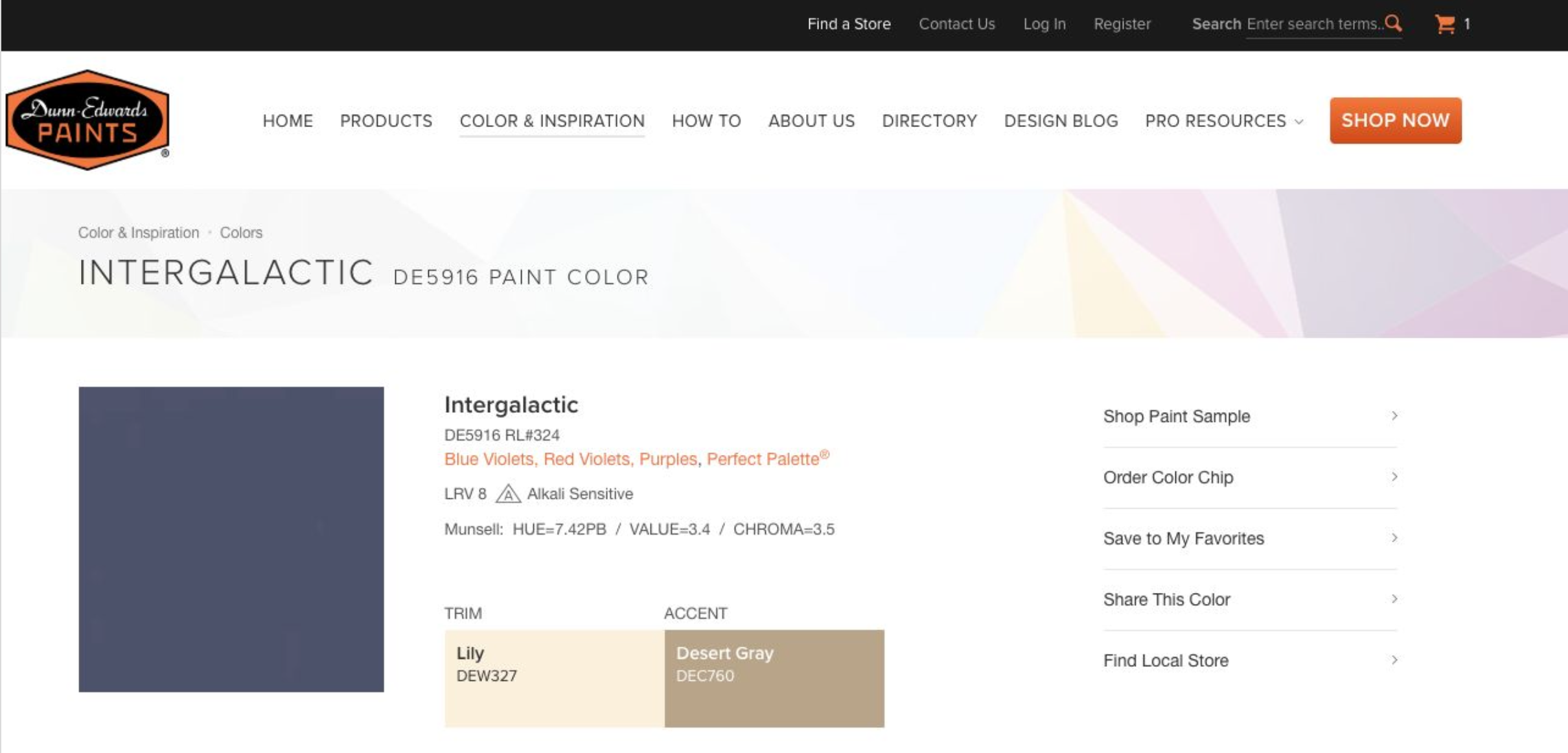
Old Color Page
Solutions Implemented
1. Navigation and Architecture Update
Simplified navigation to reduce cognitive overload when choosing a navigation item.
Restructured website architecture combining “Inspiration”, “How to”, and “Design Blog” into a single “Exolore”, making it clear for New Users where to start their journey.

Old Navigation

New Navigation
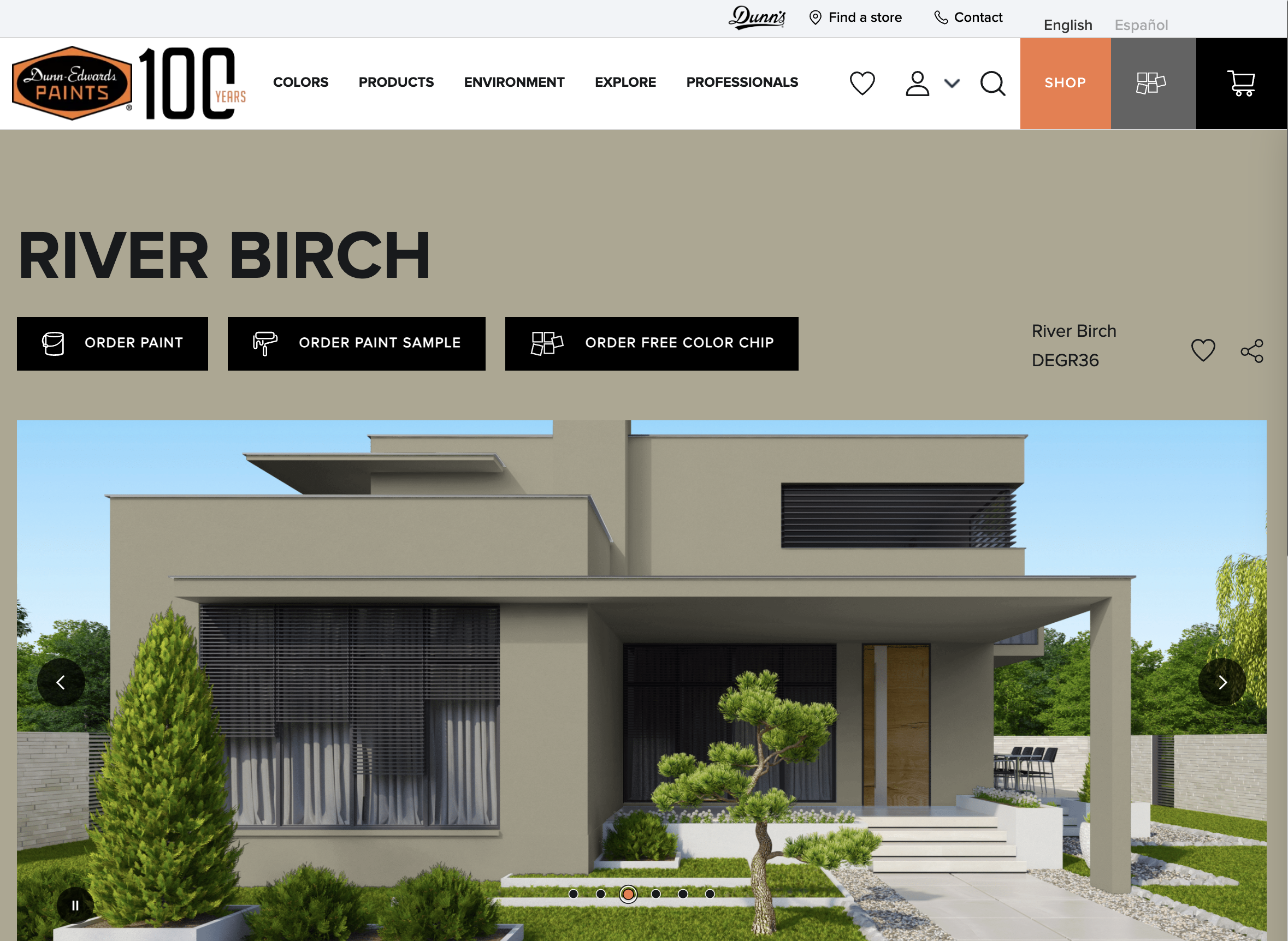
2. Color Page Update
Items related to color were given the primary call to action, while less important items were given less visual treatment as outline icons.
The color rendering feature was implemented to enhance the experience, converting the users in the discovery flow to engage with the bussiness.
3. Homepage Update
The direction was to provide relatable content on the homepage, moving away from relying on navigation for users to find the content they desire. We all know users scroll, not read. Let’s catch their attention by giving more visual space for them to digest.
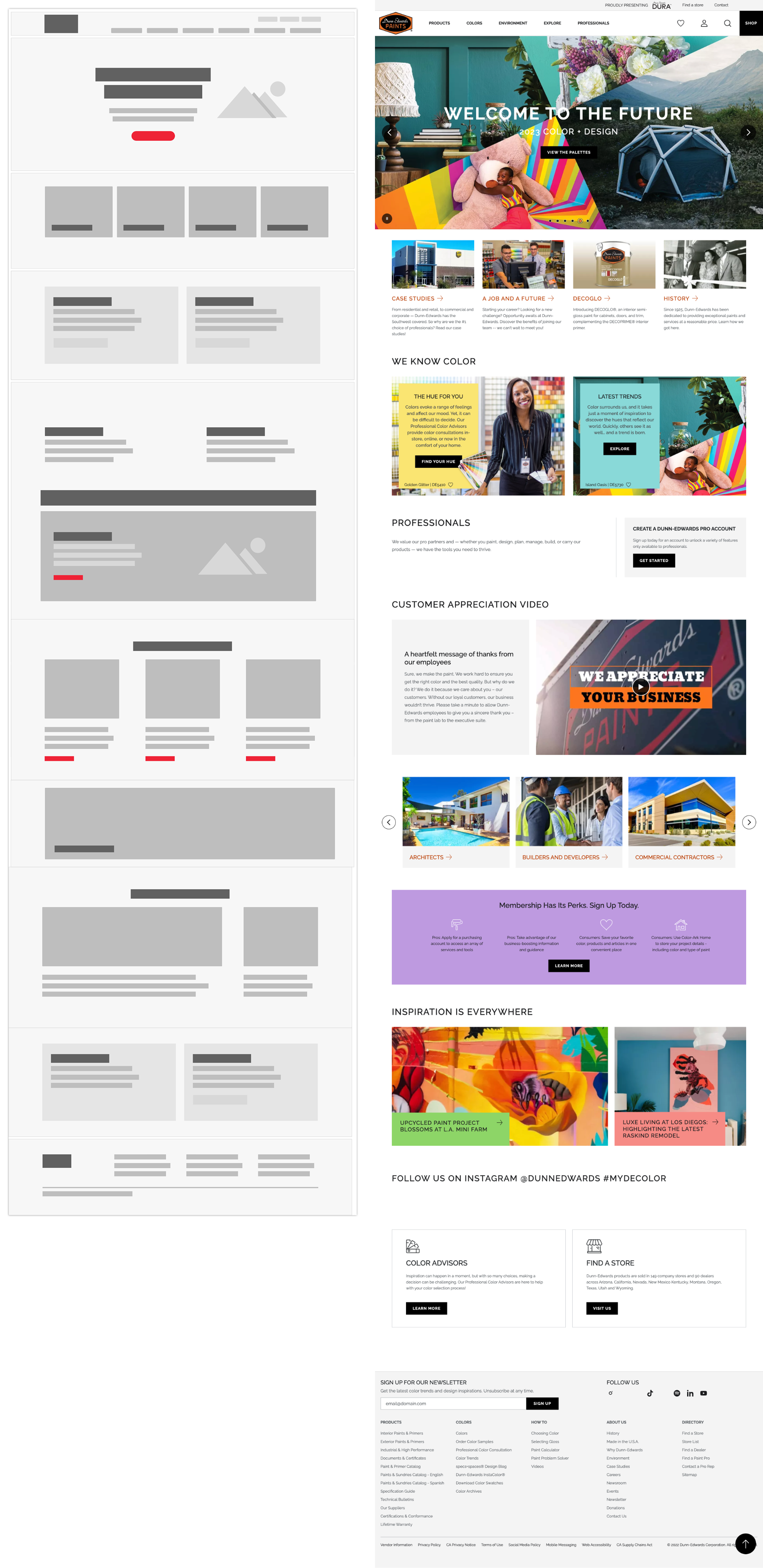
Example of wireframe to final product
Wireframe Deliverable
While the case study above highlights key focus points of the project’s success, the project was to revamp the full website.
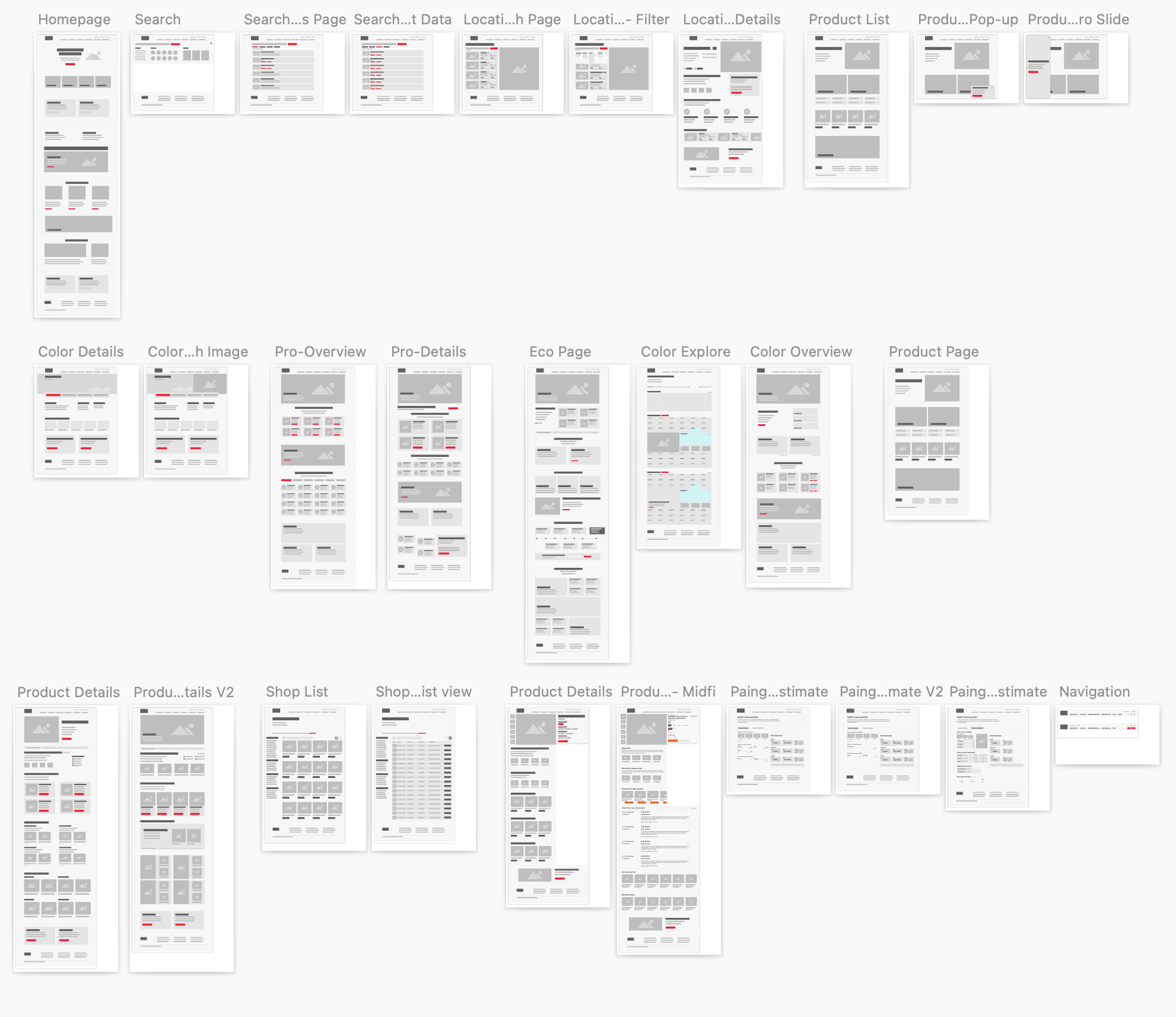
Full website wireframe example
Final thoughts…
While collaborating with stakeholders, I thoroughly enjoyed learning about the brand’s commitment to environmentally friendly paint and the exceptionally high standards they uphold. Every conversation with the stakeholders was enlightening, offering valuable insights into the brand’s rich history and legacy, cultivated over more than a century of operation.
Thank you for reading.